

Dr. Brian Lee, DDS, Inc.
Responsive Web Design
Background
Problem: While Dr. Lee’s Dental Clinic’s website is already responsive, it does not perform optimally when accessed on tablet devices. The navigation, layout, and content do not adapt effectively, resulting in a subpar user experience on medium-sized screens. Additionally, the website’s overall style and aesthetic, including UI elements, color choices, and layout, could be improved to provide a more modern, professional, and visually appealing experience. Enhancing these aspects would help reinforce the clinic’s brand and make the site more inviting and easy to navigate for potential and current patients.
Solution: The project will prioritize optimizing the responsive design of Dr. Lee’s website, with a focus on improving the user experience on mobile devices, as they are likely the most common access point for patients. Enhancements will include refining the layout, navigation, and content presentation to ensure seamless functionality across phones, tablets, and desktops. Additionally, the visual design will be modernized with updated UI elements, a more cohesive color palette, and improved typography, creating a professional and inviting interface that better reflects the clinic's brand.
UX Research Goal
To uncover the key pain points, needs, and expectations of patients seeking dental services online, with the goal of designing a website that fosters trust, communicates authenticity, and provides a seamless user experience.

Research Objectives

Understand how potential and existing patients interact with the website and its features.

Identify key pain points, needs, and expectations of patients seeking dental services online.

Provide a seamless user experience that aligns with patient preferences and behaviors.
Methodology - User Interview
Participants:
Interviewed 5 participants, aged 25 to 40, to gather diverse perspectives from individuals in this demographic who have experience using dental services and navigating related websites.
Users want the convenience of online appointment scheduling. Calling to book is seen as outdated and less efficient.
Many users find dental websites lacking in clear service descriptions and pricing, which leads to confusion and frustration. Providing more detailed information, especially regarding insurance coverage, would improve transparency.
Users rely heavily on reviews when selecting a dentist. Credible, real, and clearly sourced reviews would enhance trust.
There’s a strong preference for websites with clear, modern design. Real images of the office and staff add authenticity and make users feel more comfortable.
Users expect quick access to essential details (services, availability, and contact information) when visiting the site on mobile.
Methodology - Competitive Analysis


To better understand the market, I analyzed key competitors, including Tammy Tran DDS, Christopher D. Nagel, and Western Dental. While all three provide essential information about services, most fail to balance professionalism with approachability, and few highlight clinic authenticity. This analysis emphasized the opportunity to create a trust-building, user-friendly design tailored to Dr. Brian Lee's practice.
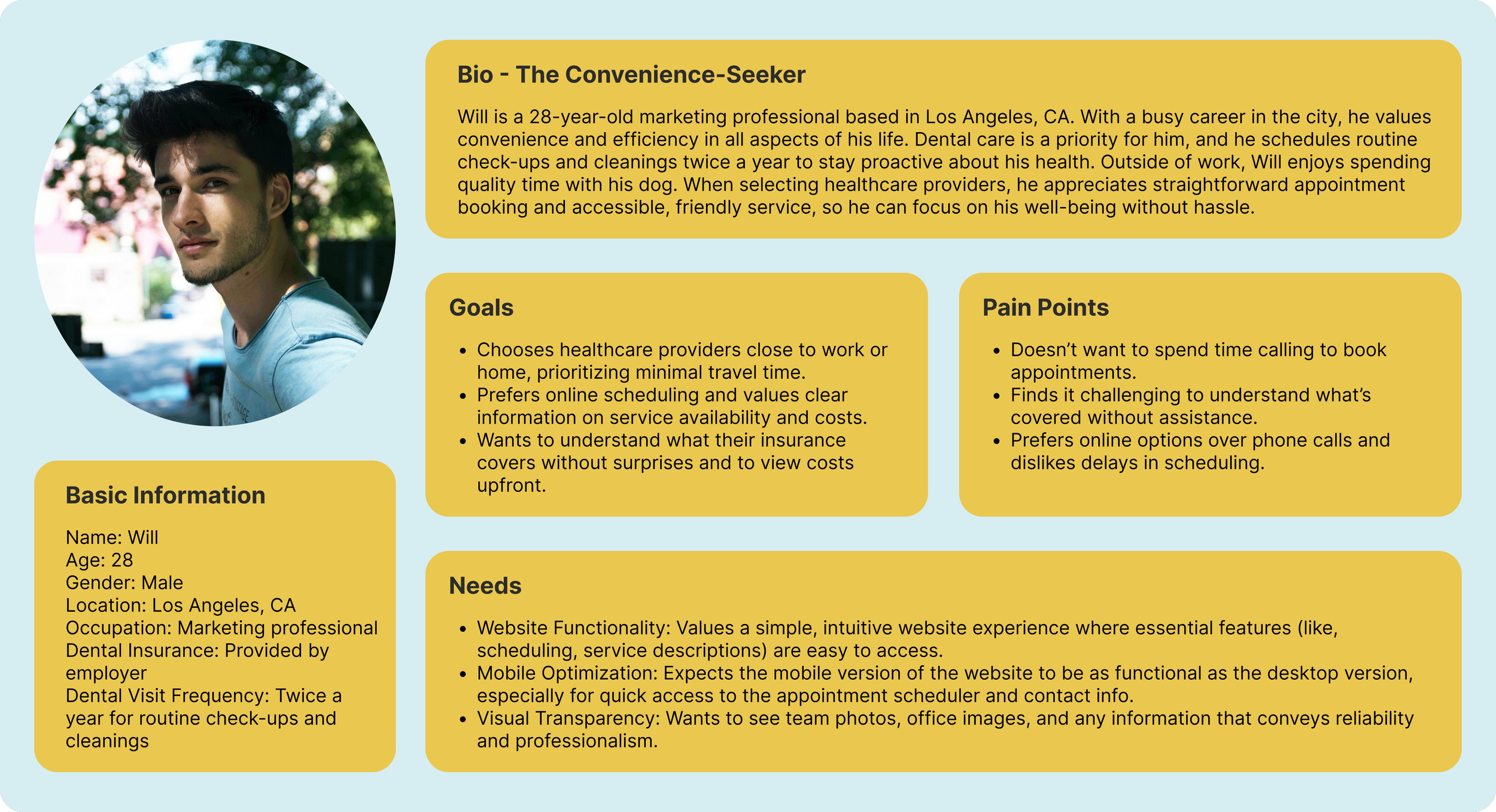
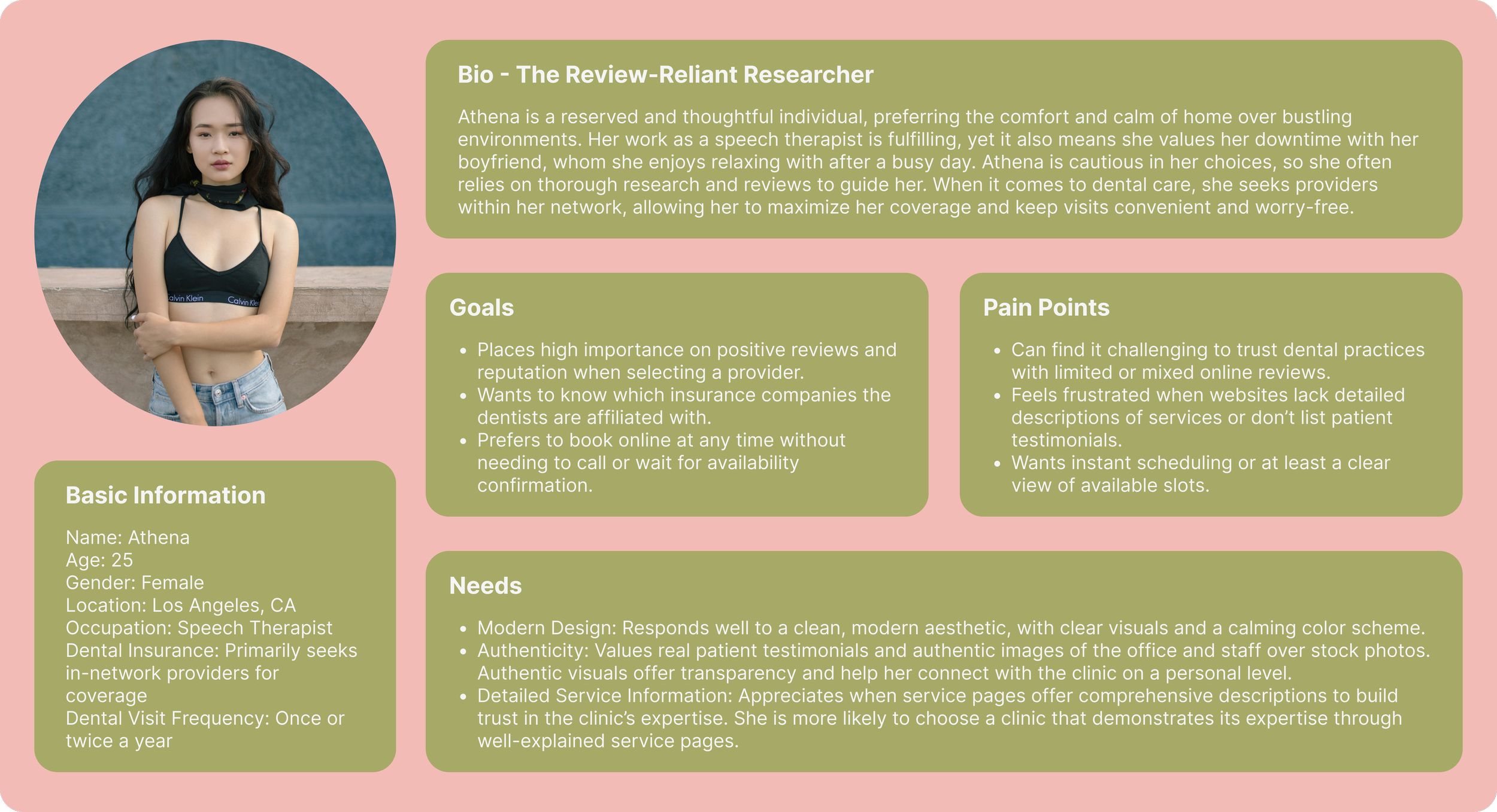
Persona #1
Persona #2
Problem Statement
Convenience-Seeking User
POV: Users who seek convenience in finding dental services need a quick, reliable way to book appointments because their busy schedules limit the time available for extensive research.
HMW: How might we streamline the appointment booking process to make it faster and easier for users with limited time?
Assurance-Seeking User
POV: Users who value transparency and trust need clear and authentic information about the dental clinic’s services and environment because they want assurance of the clinic’s quality before booking an appointment.
HMW: How might we build trust and convey the clinic’s authenticity through real patient testimonials, comprehensive service descriptions, and staff images?
Information-Seeking User
POV: Users who rely on detailed service information to make decisions need easily accessible, thorough descriptions of the clinic’s offerings to feel confident in their choice of provider.
HMW: How might we provide comprehensive, user-friendly service information that helps users make informed decisions without feeling overwhelmed?
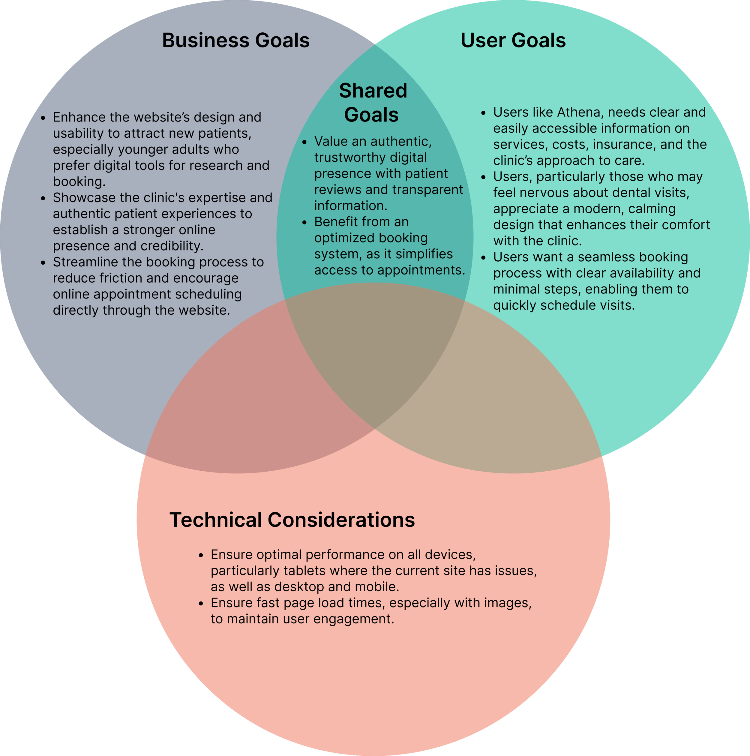
Project Goals

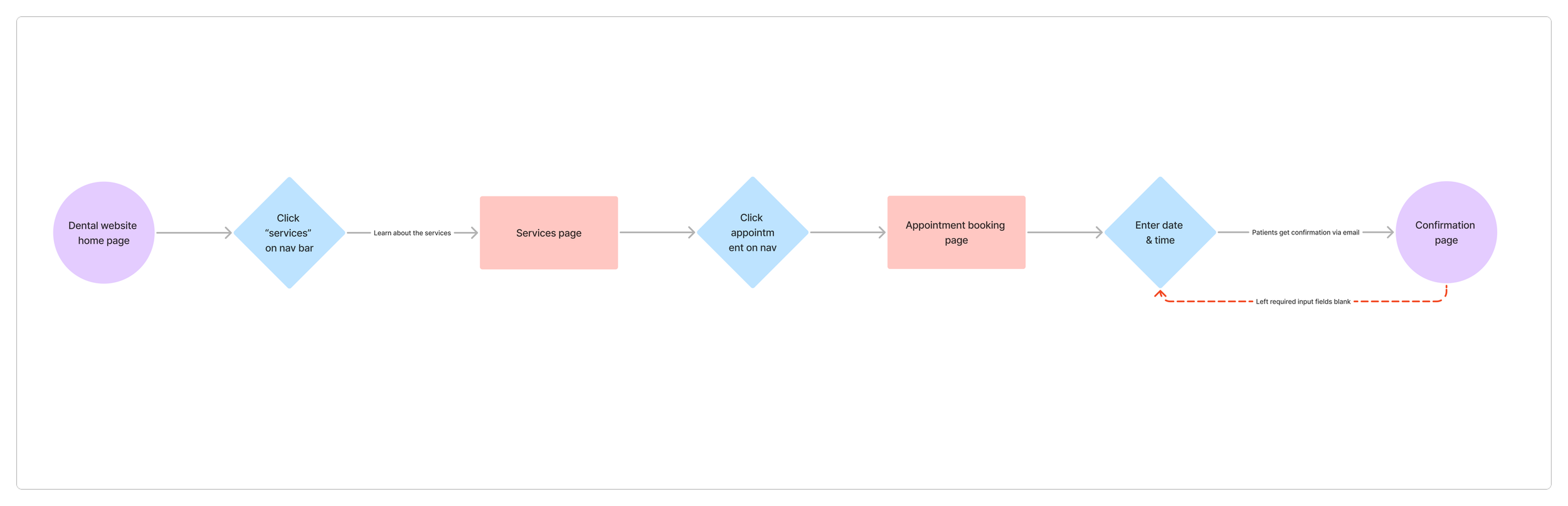
User Flow #1
Book an appointment on Brian Lee's website
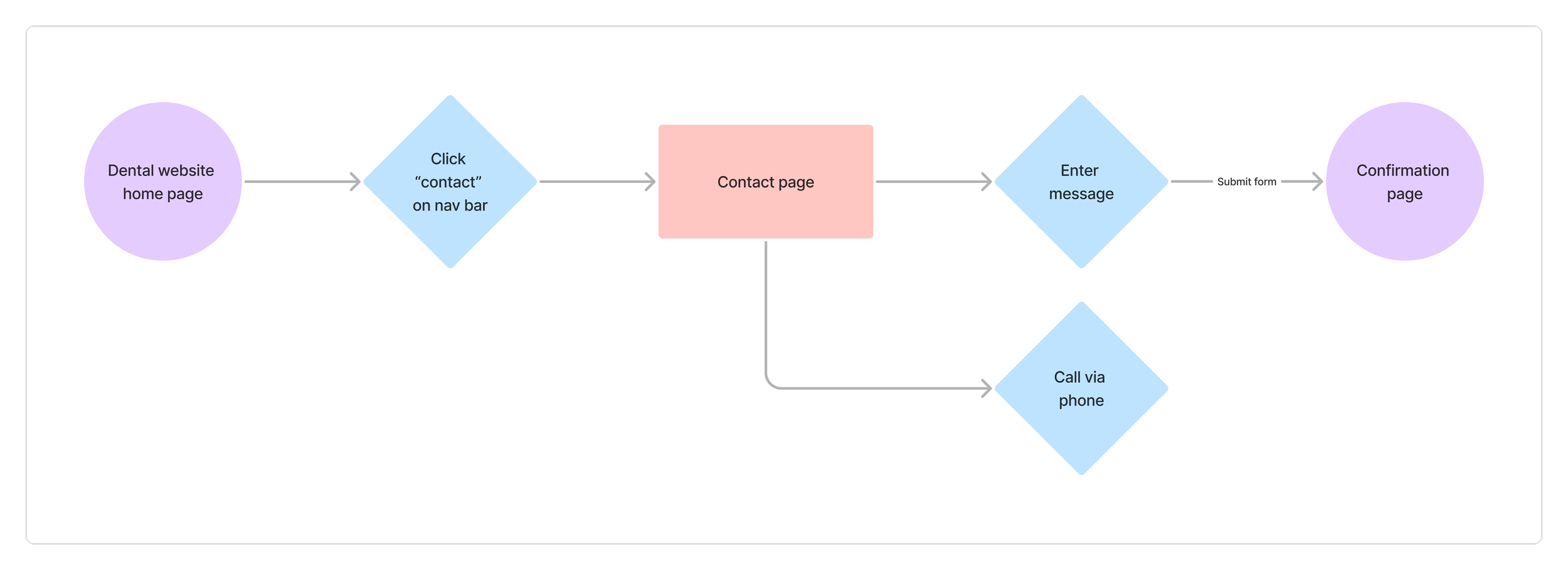
User Flow #2
Contacting the clinic
Mid-Fidelity Wireframes
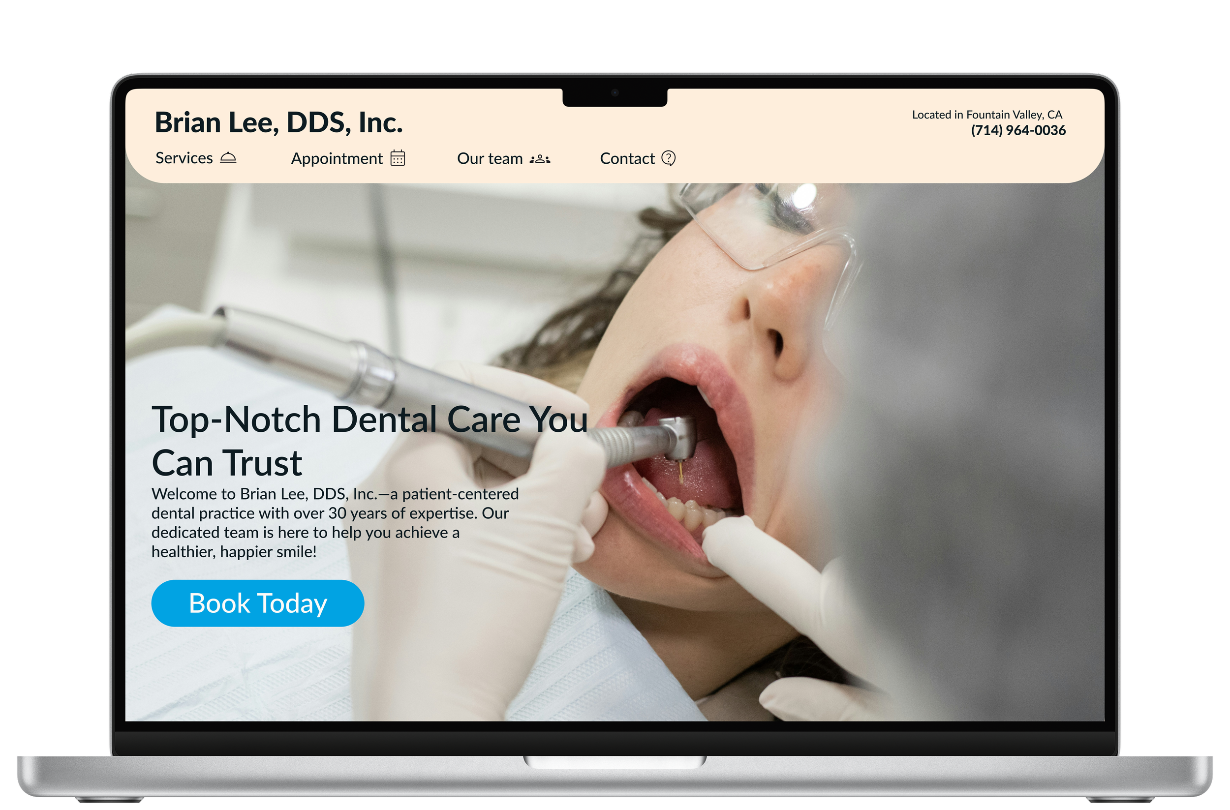
Home Page
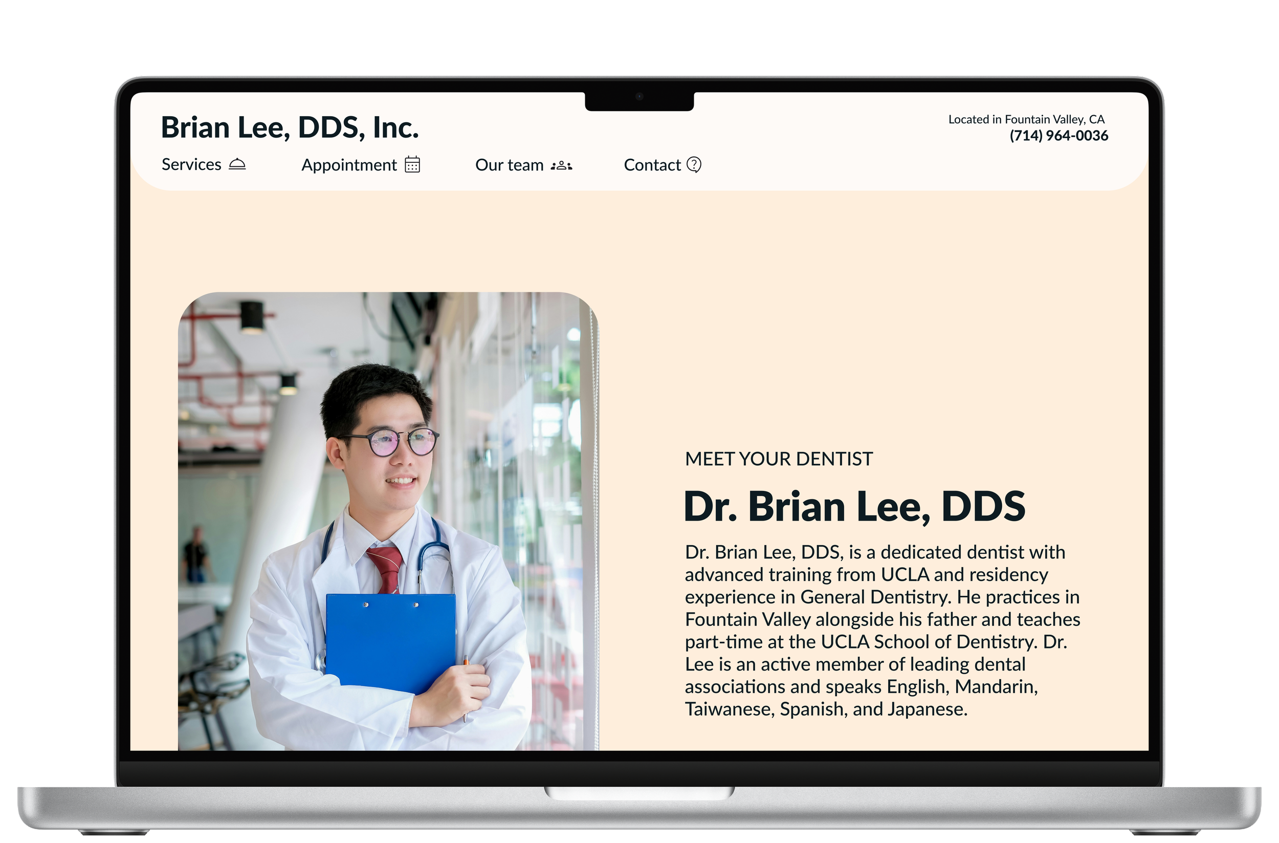
Our Team Page
Services Page
Mid-Fidelity Wireframes (Cont)
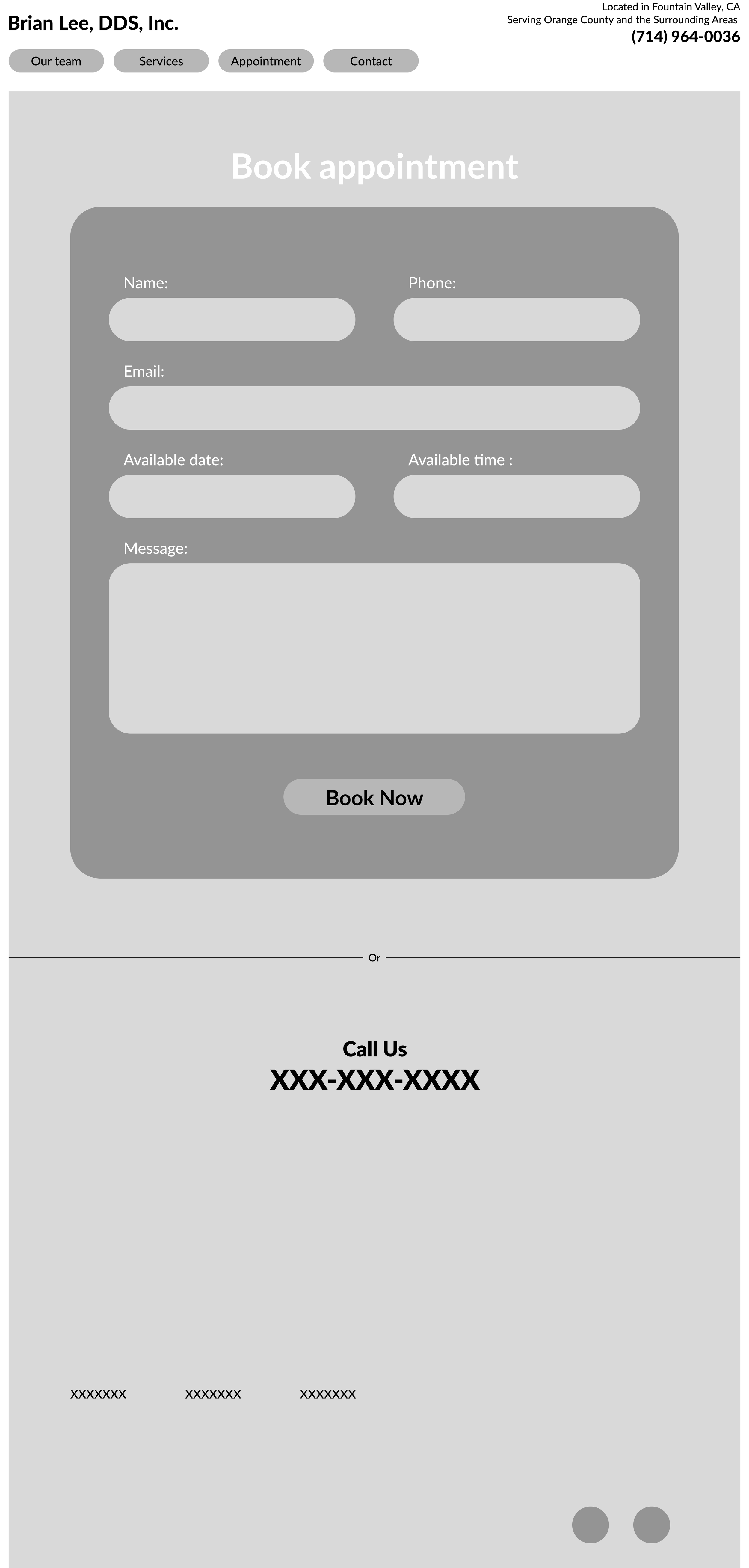
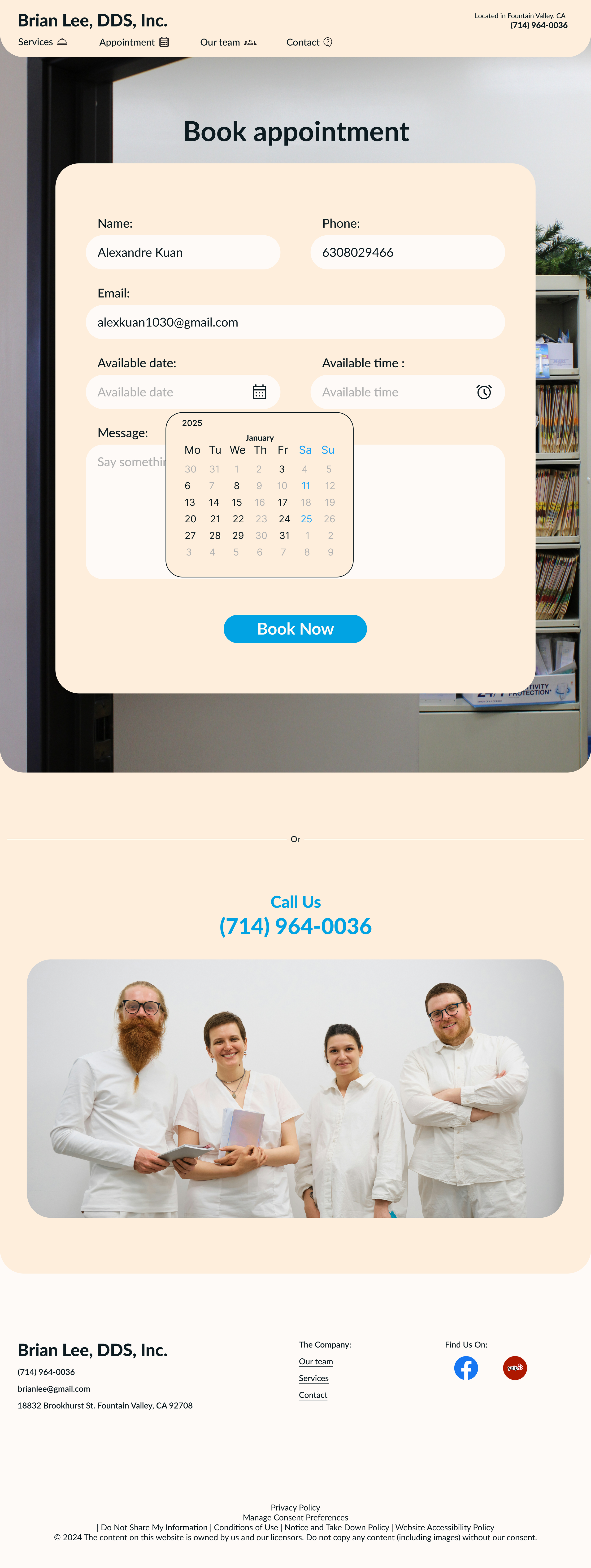
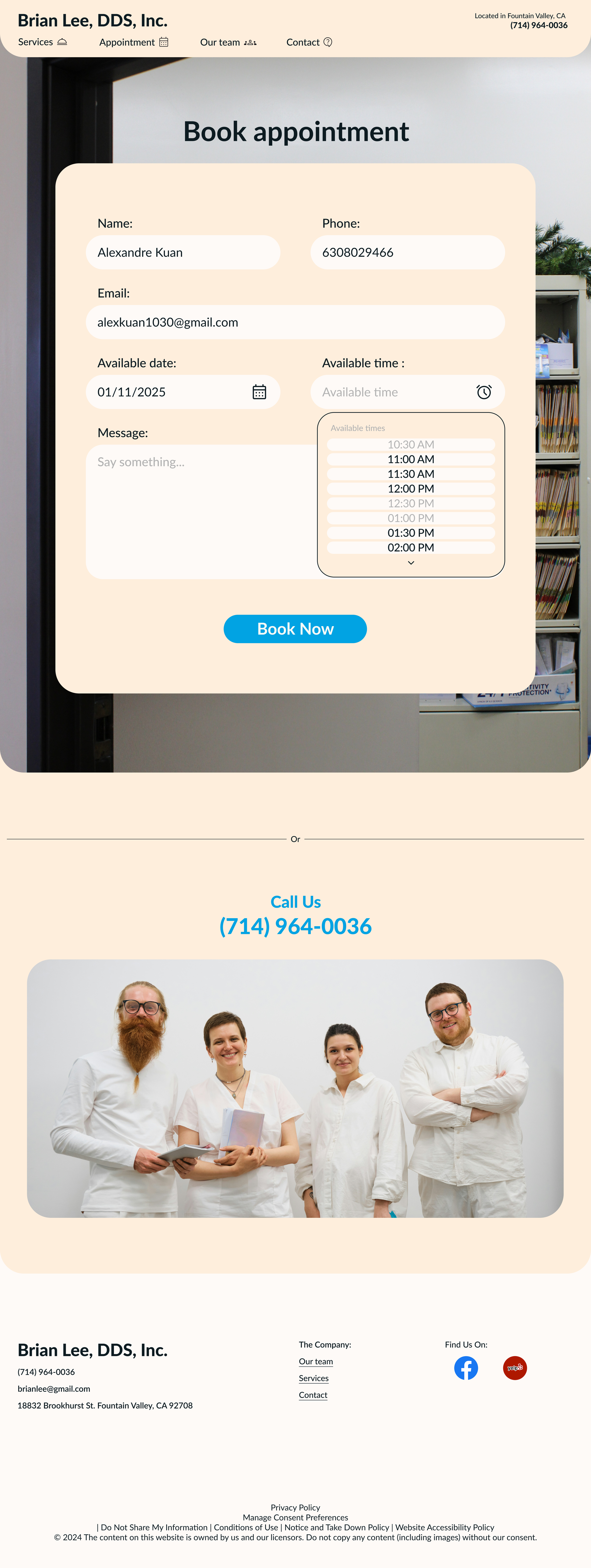
Appointment Page
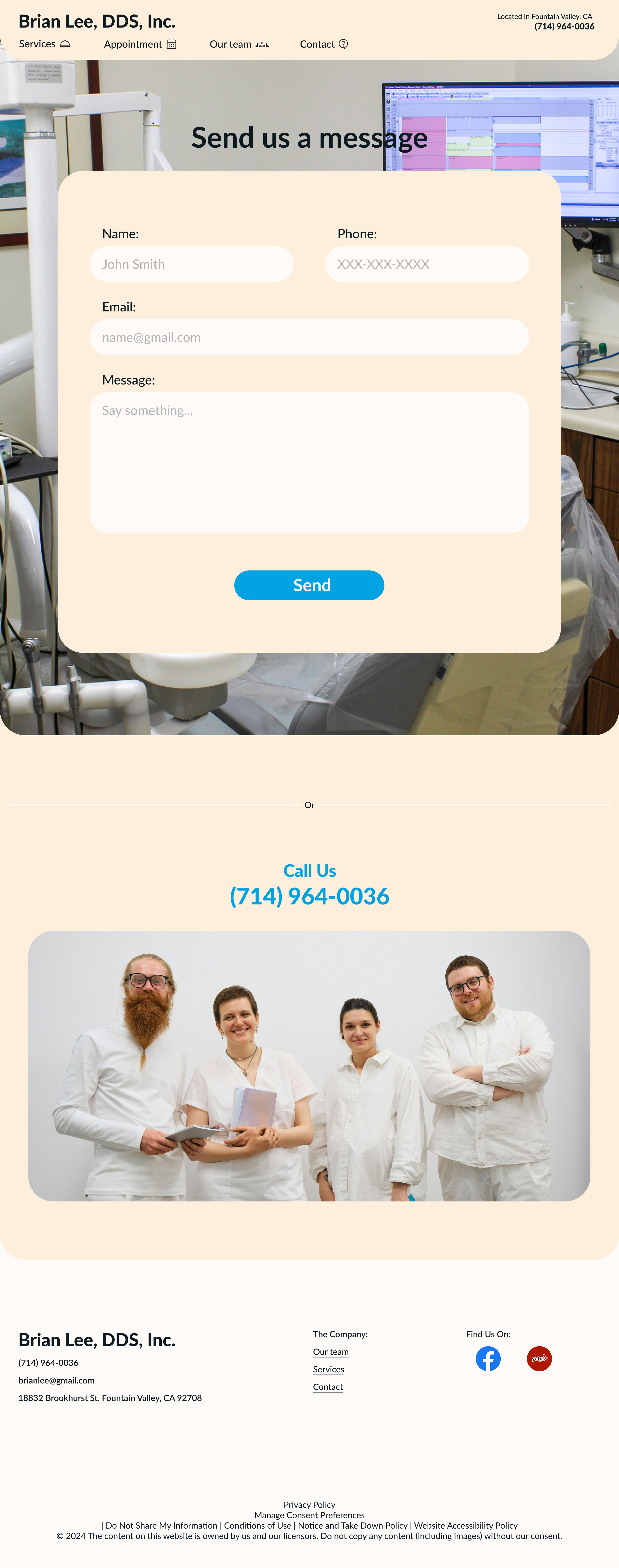
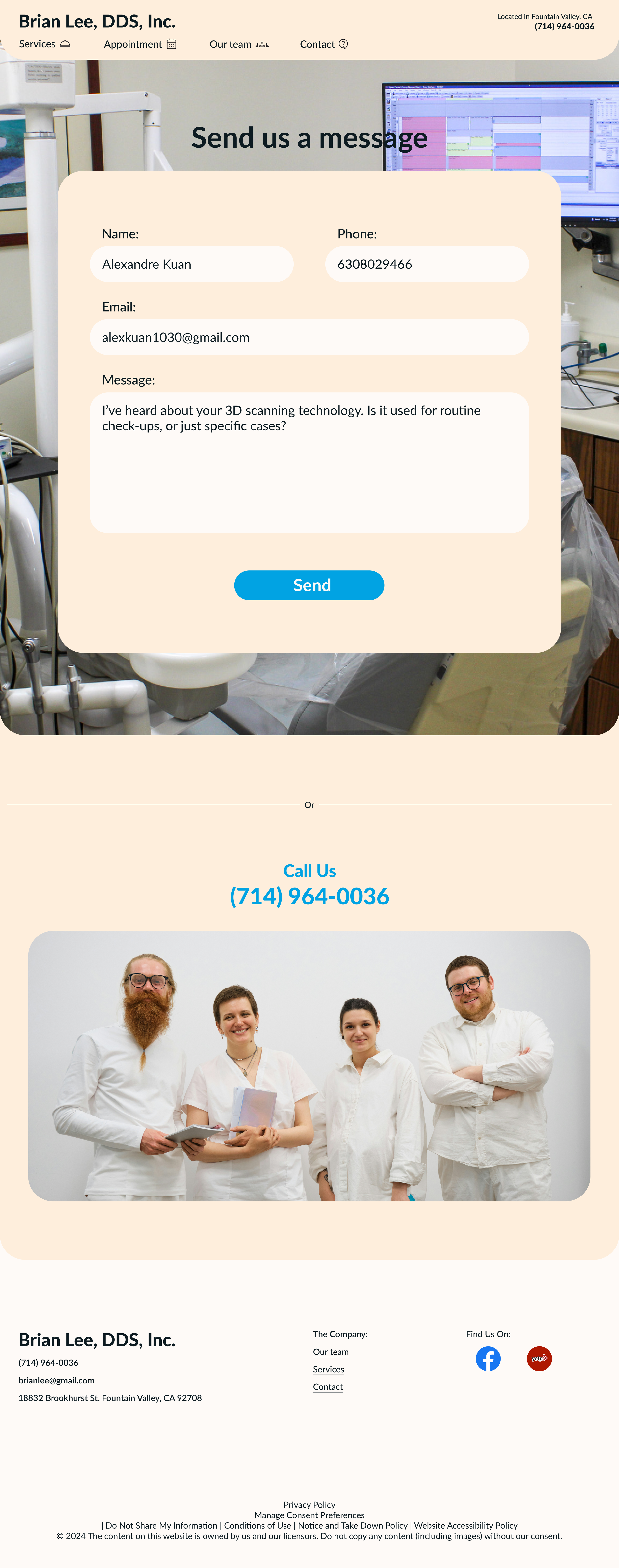
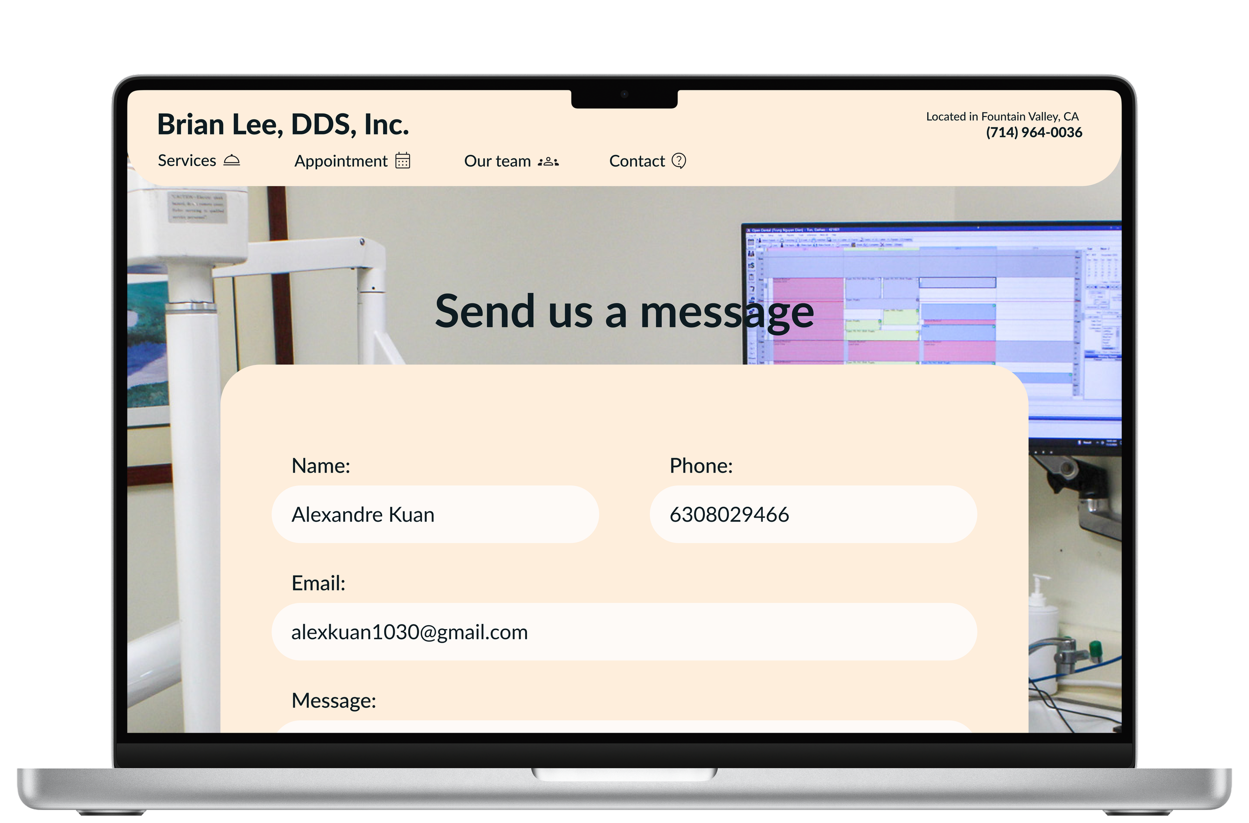
Contact Page
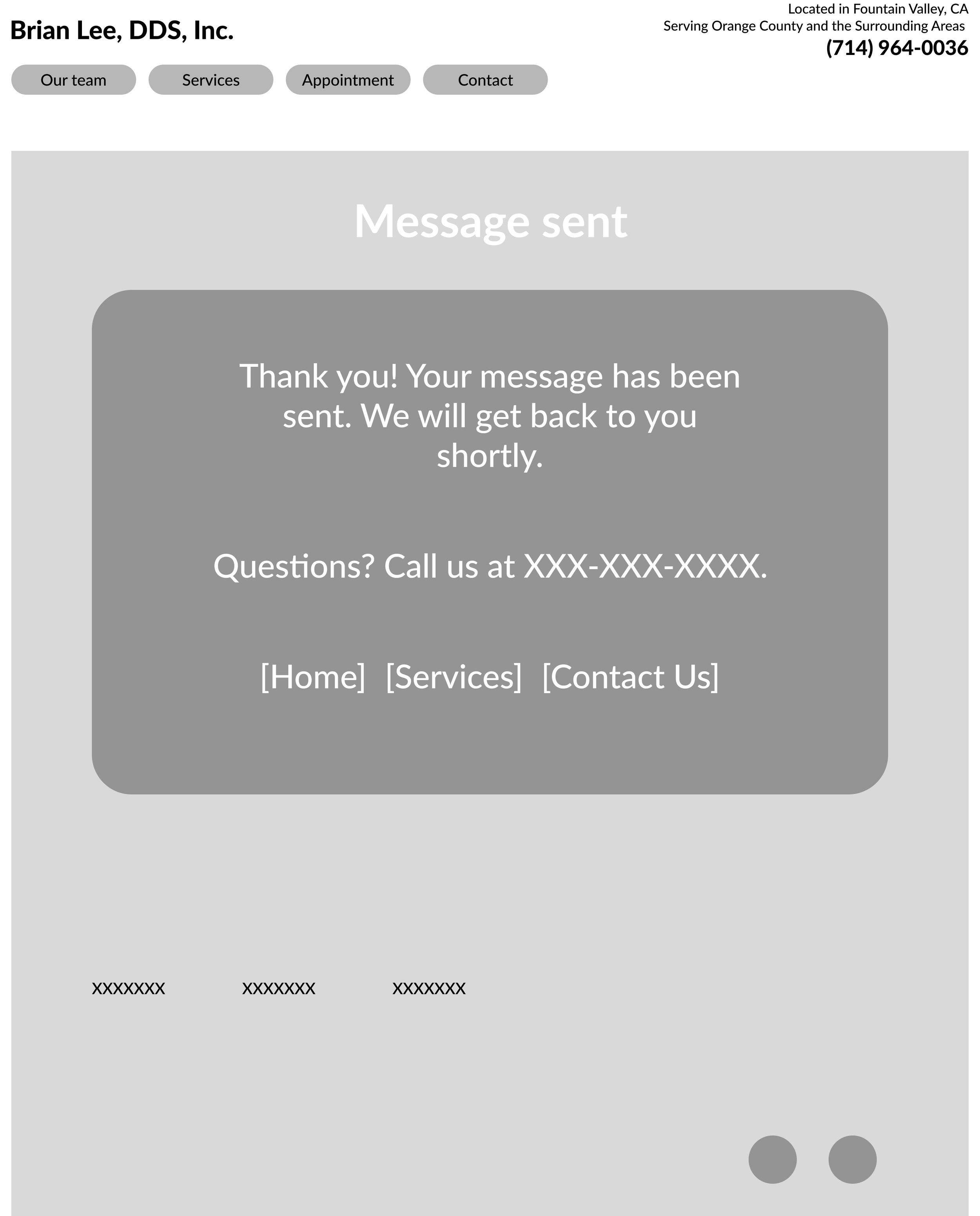
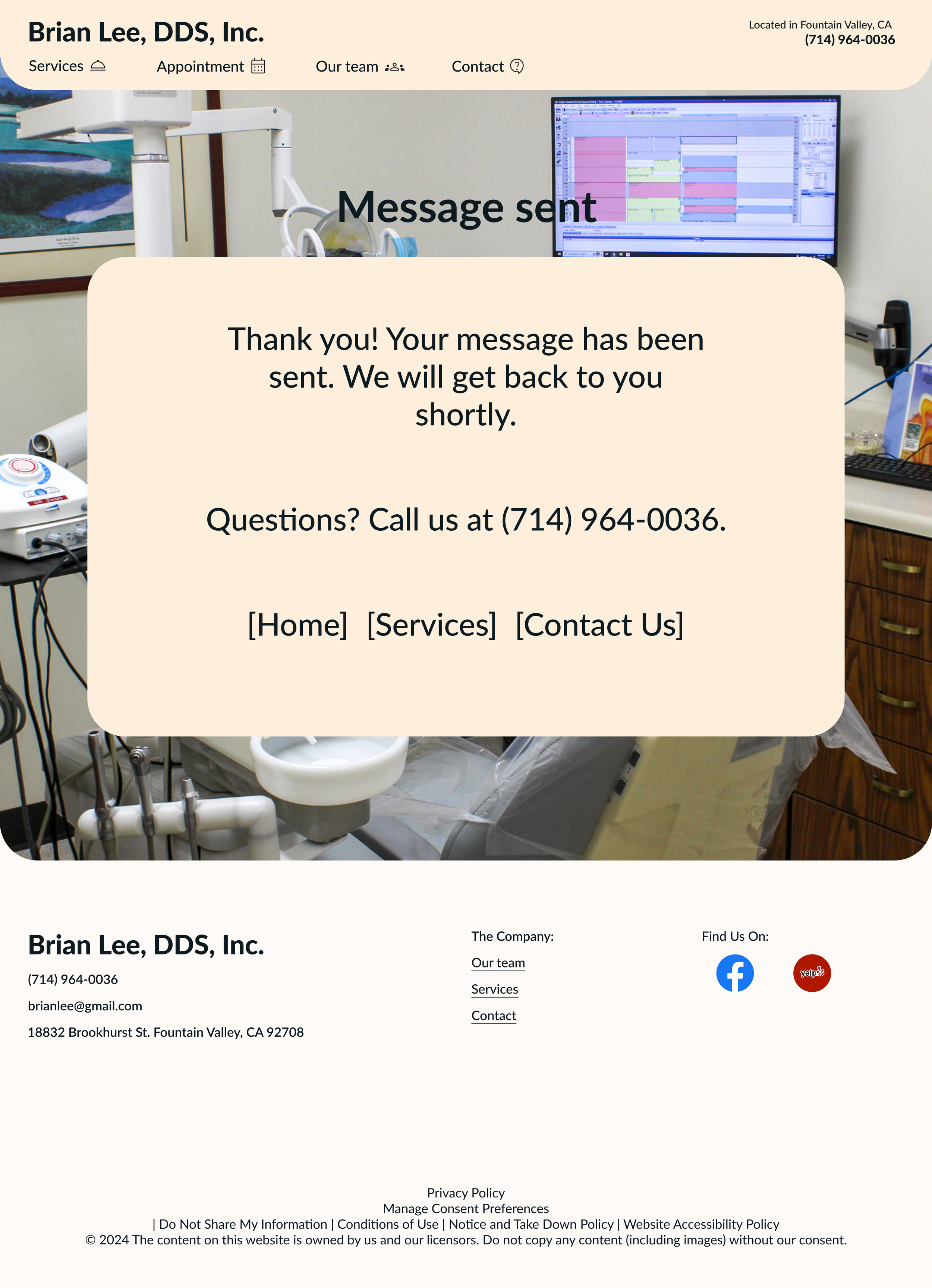
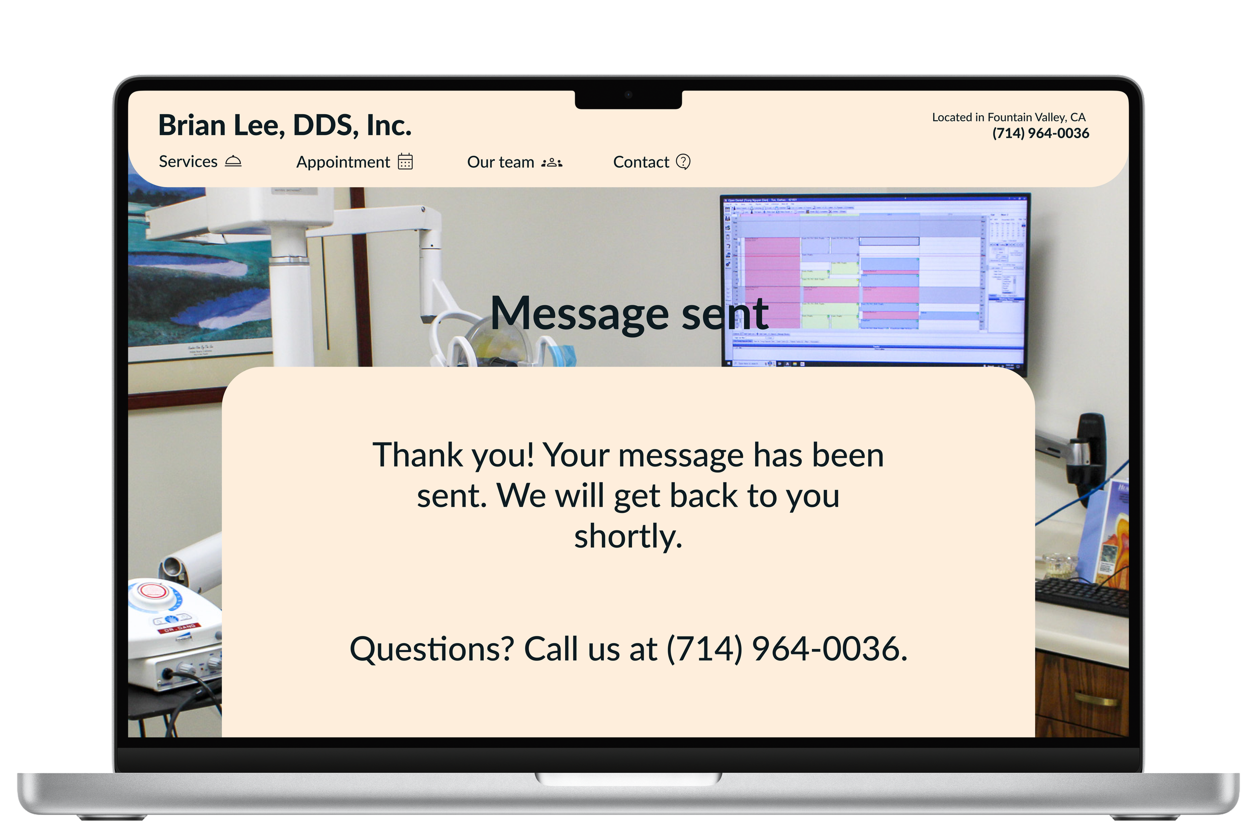
Message Sent Page
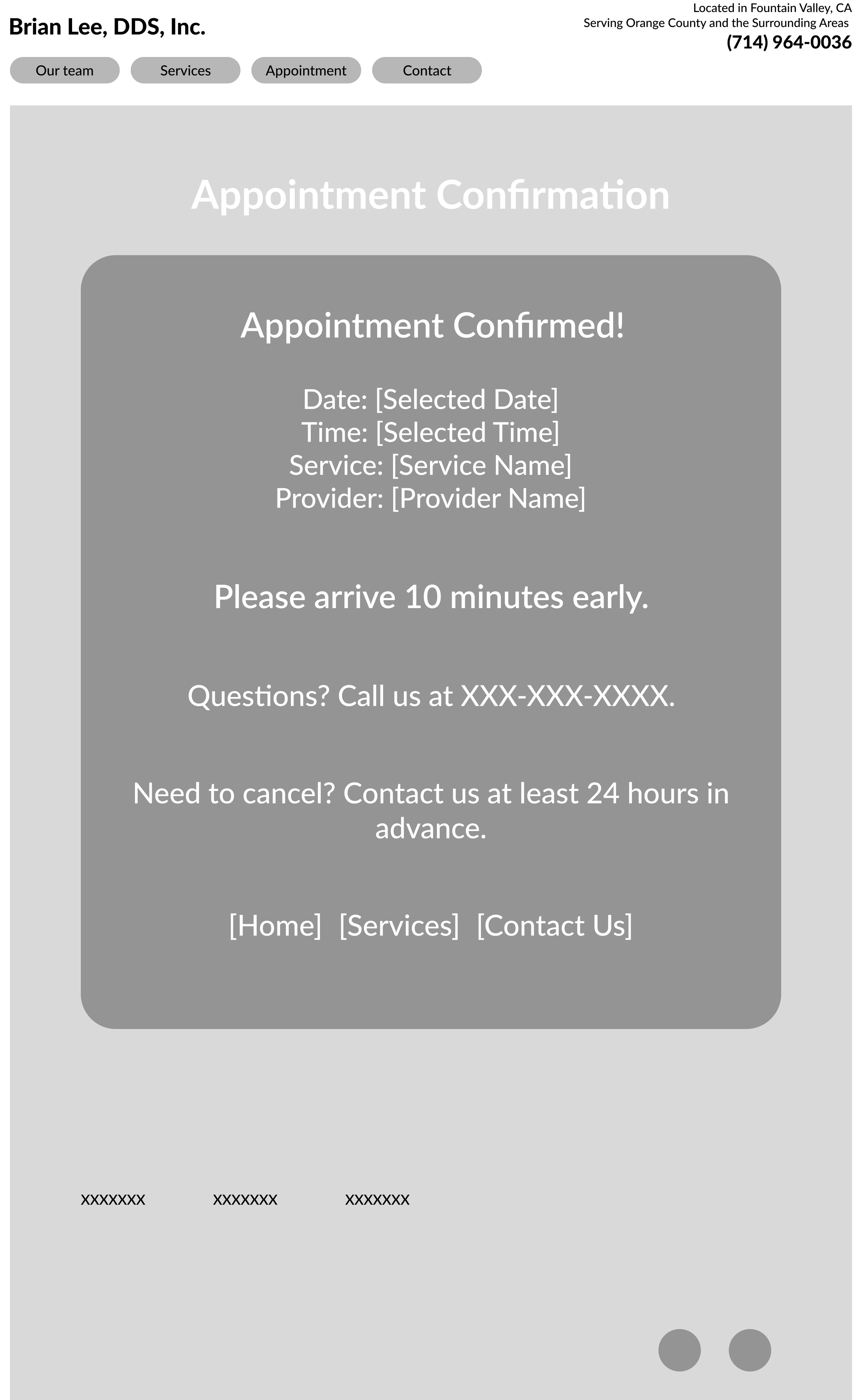
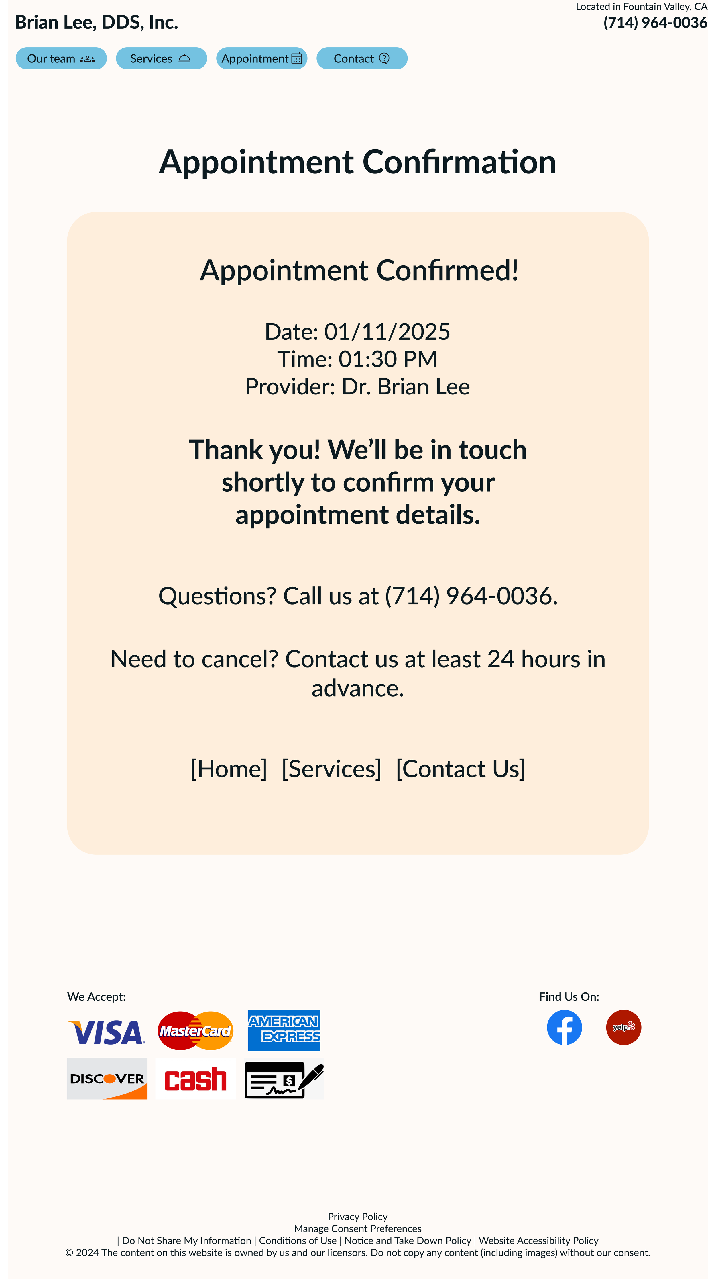
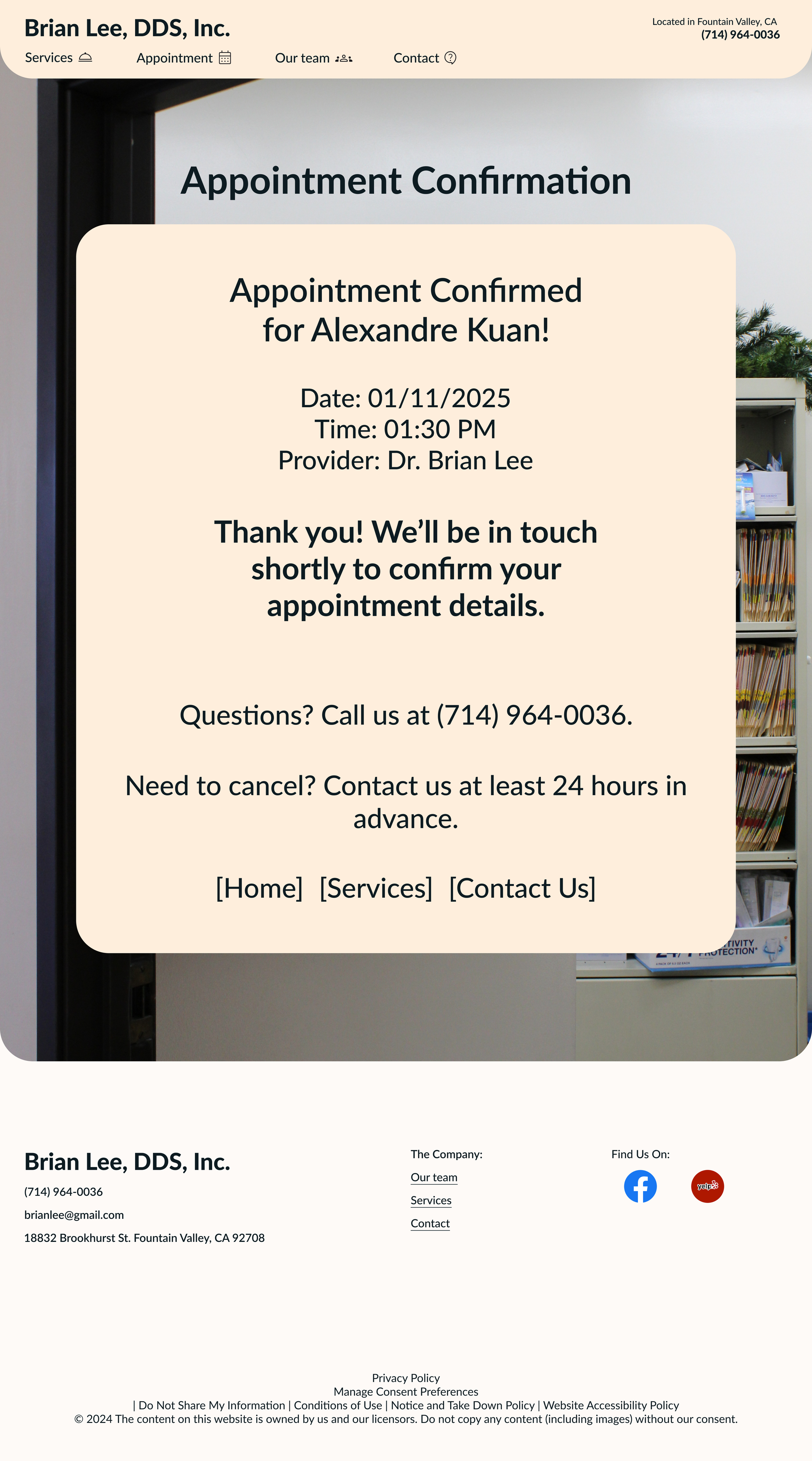
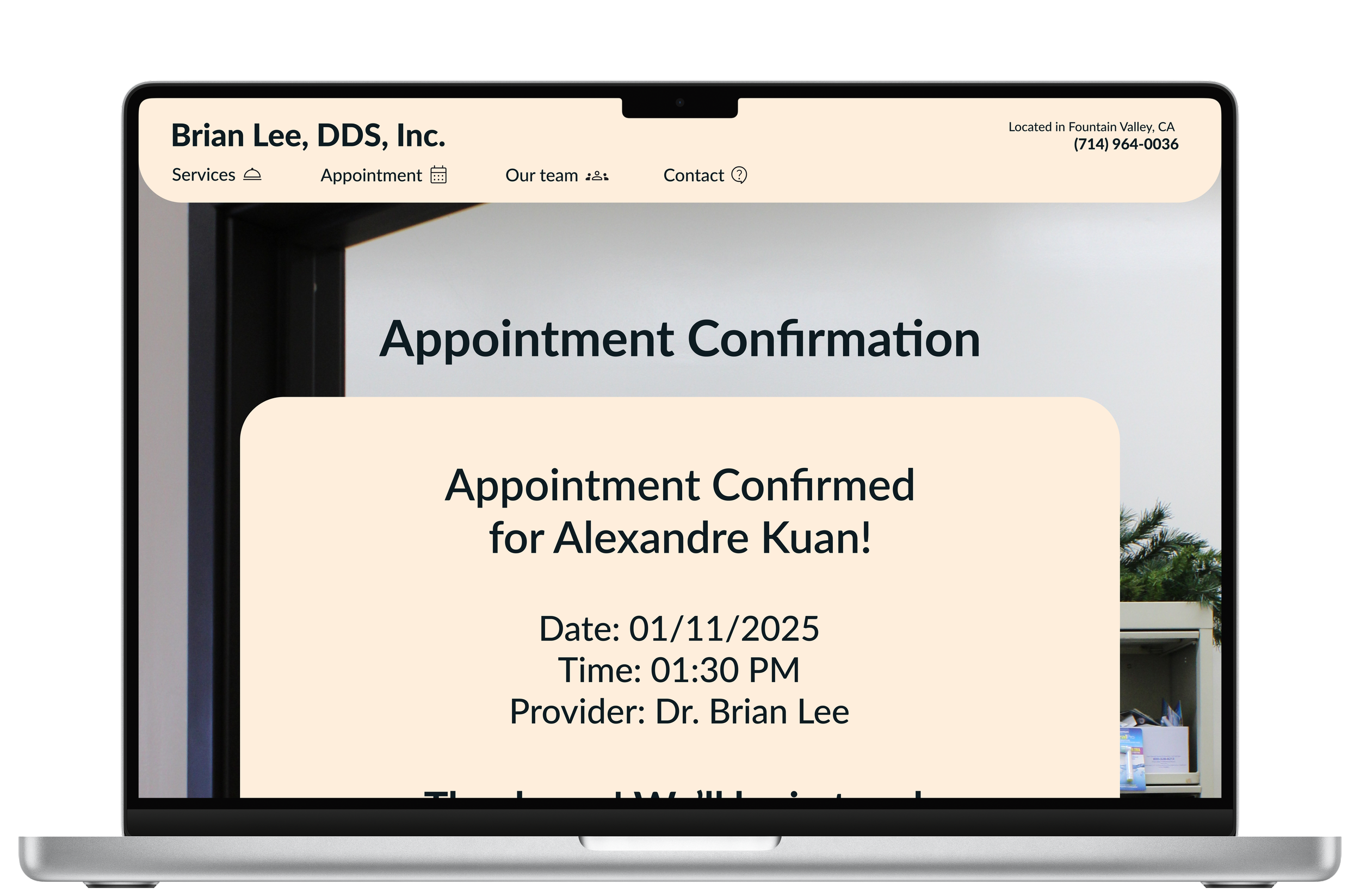
Confirmation Page
Hi-Fidelity Wireframes
Home Page
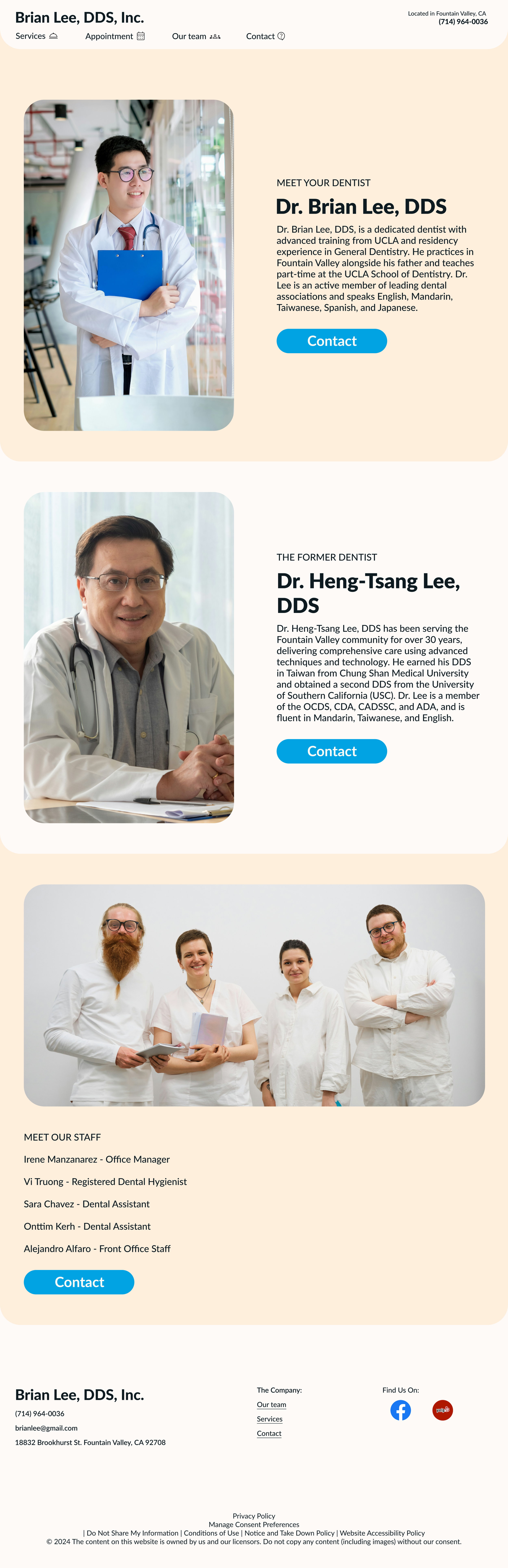
Our Team Page

Services Page
Hi-Fidelity Wireframes (Cont)
Appointment Page


Hi-Fidelity Wireframes (Cont)
Contact Page
Usability Test Results
Success Metrics
Task Completion Rate: 100%
Time on Each Task: Around one minute.
Ease of Use Rating (1 = difficult, 5 = easy): 5
All participants rated 5 (very easy) for the ease of use.
One participant mentioned she couldn’t go to the contact page from the appointment confirmation page.
Booking an appointment is easy because the “book today” button is eye-catching.
The design is good but buttons on the nav bar can be rearranged from the most used to the least used.
One person mentioned that the font is a bit hard to read.
Want to have a 24/7 assistant chatbox.
The design is intuitive, it was simple and straight to the point without any unnecessary components.
One participant mentioned “I think it makes more sense if the booking appointment has a list of selected dental procedures.”
Might consider other color themes.
No unexpected issues or behaviors.
The calendar doesn't work, can’t scroll to other months.
Appointment button on the nav bar should be located in the first place.
The confirmation message should include the patient's name too.
Iterations
Need to give access to the contact page from the appointment confirmation page.
Rearrange the button order on the nav bar.
Include the patient's name in the confirmation page.
Iterations Comparison
Before
After


Before
After
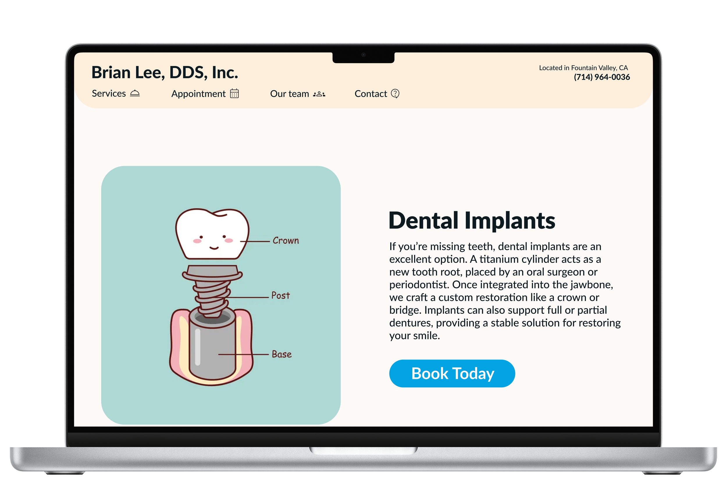
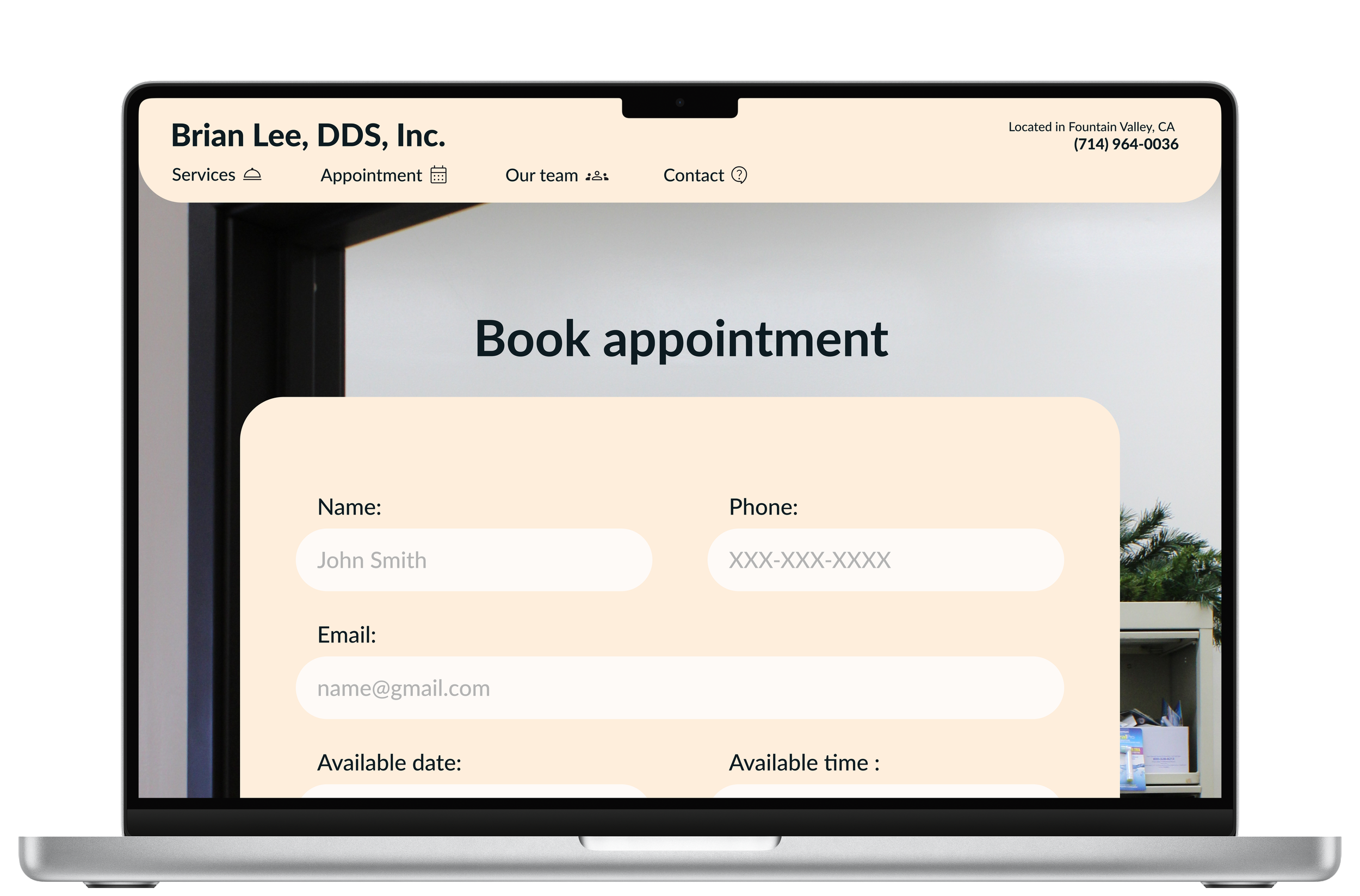
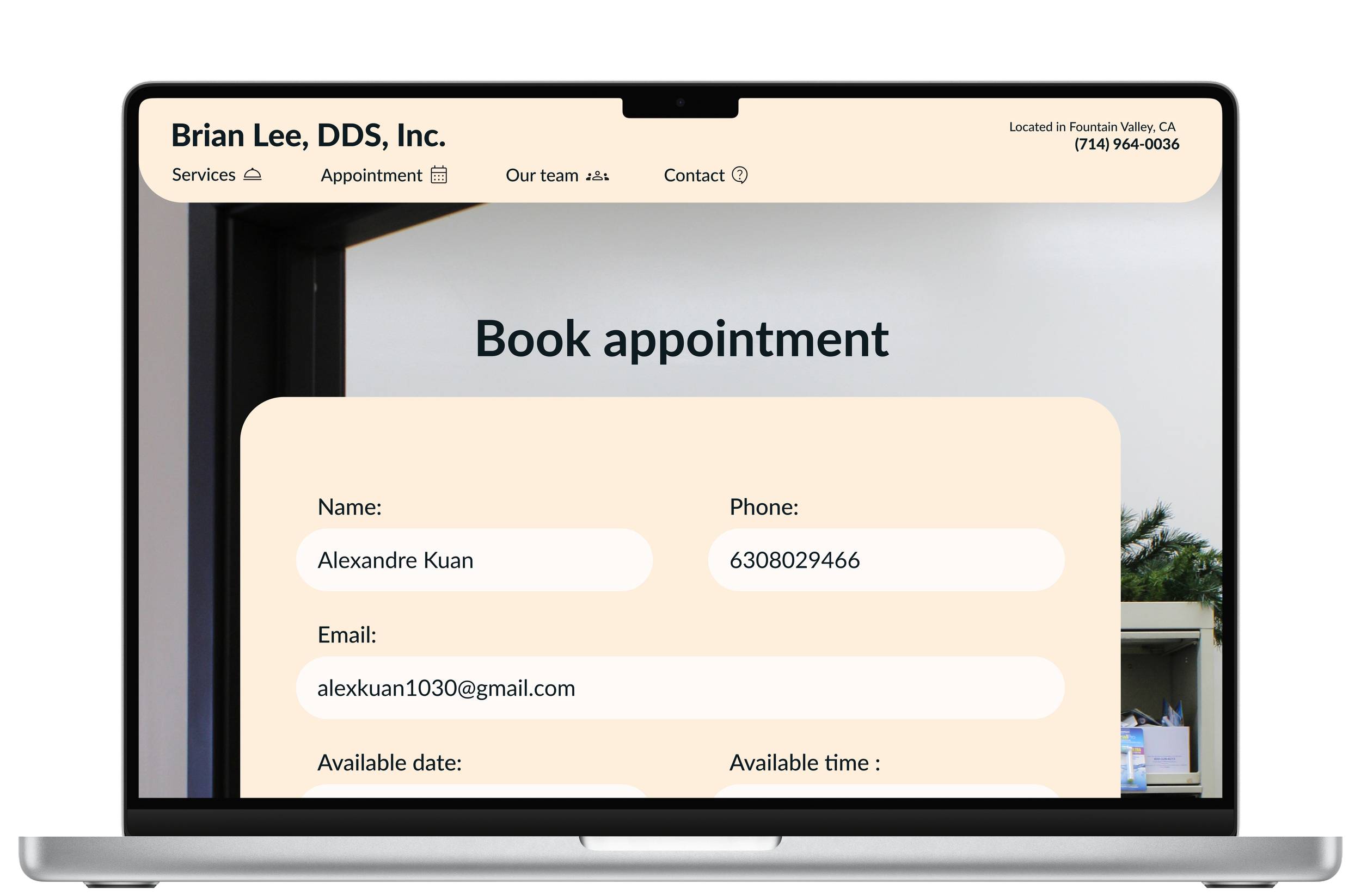
Final Design
Home Page

Our Team Page
Services Page
Appointment Page


Contact Page
Challenges and Key Learnings
Challenges
Managing Iterations Effectively: Balancing feedback from user testing, client preferences, and modern design practices posed a challenge during the iterative process.
Navigating Figma Functionalities: Overcoming technical difficulties with Figma required additional effort to execute the desired design changes efficiently.
Key Learnings
Balancing Client and User Needs: Successfully aligning the client's goals with user-friendly design practices taught valuable skills for handling client expectations in future projects.
Importance of Competitive Analysis: Identifying outdated competitor websites highlighted the significance of modern, welcoming designs in making a strong first impression and attracting clients.